Recently Roz Stendahl (see link below) asked
me if I could 'offer any suggestions on readings or things that you felt
were helpful to you in dealing as a visual artist with color blindness.'
This was my answer:
Colour Blindness
 |
I've got a slight red green colour blindness but I think that since
schooldays, when it was first recognised in a medical, I've educated
my eye and compensated for it. Constable is said to have had a similar
condition so I'm in good company.
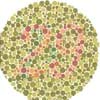
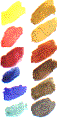
The pebble-like tests (left, link to full test below) where
you're supposed to read a number were the ones that I couldn't manage
when I was at school, probably still couldn't now, but after art
school I tried another type of test where you had to say which of
three colours, shown as spots on a black background was most similar
to a single spot shown above them (none were exact matches). I scored
100% at that, which pleased me.
It's hard to believe how monochromatic the 1950s and even the 1960s
were here in Britain, with black and white television, magazines
and so on. I think I've had far more chance to educate my eye since
then. |
| I see
'26' here, a person with a greater degree of red/green colour blindness
would see only spots while someone with normal colour vision would
see '29'. |
Sketchy Vision
 |
I was so pleased when an artist friend said recently, glancing
through my sketchbook, that I had a good eye for colour. 'Do you
really think so?' I said.
One thing that knowing I have colour blindness gives me qualms
about is that I don't think I can use colour as an emotional or
symbolic device. This would be like me trying to be an opera singer
without perfect pitch. But I'm very happy to sit in a landscape
and be as honest as possible trying to capture the colour of a sky,
a dead leaf etc. I'm aware of the limitations of photography to
perform this function and I think that I can do as well as that.
|
For the same reason I can't get terribly interested in colour
field abstract painting because I have an nagging doubt that I'm
probably not seeing what the artist intended me to see. For this
reason I've never studied it.
But the straightforward approach to colour - just paint what's
there, then there's no excess baggage - fits in well with my approach
to drawing too.
|
 |
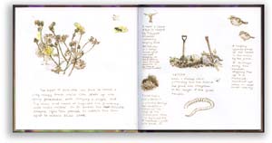
A tree is a tree . . .
I used only three primaries - crimson, cadmium yellow pale and ultramarine
- plus white when painting this acrylic on canvas. I like to keep
things simple!
|
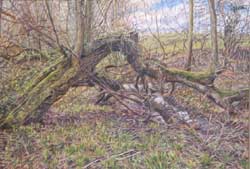
If I draw at willow I want it to look just like that particular
willow, not a generic willow. I really look at it and I think the
phrase 'a tree, is a tree, is a tree' would be a fair summary of
what I'm trying to do, so I want that extra something, the symbolism
and emotional impact, if any, to come from the tree itself with
me as a medium through which the tree can express itself.
Symbolic Colour
Symbolic colour - painting the tree red as a metaphor for sacrifice
for instance, wouldn't work for me. I'd rather my trees were the
colour of lichen, algae, moss and bark and I'm content to let the
natural symbolism come through. In fact I probably don't want even
that - to make anything a symbol for something else - I think it's
more important for the 'is-ness' to come through. |
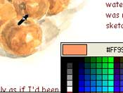
A Watercolour Palette
  Talking
a little less metaphysically, I like to keep my paintbox very simple,
the one I usually use holds only 12 colours. I always hold it the same
way around; it's got a little handle underneath. This means I'm so familiar
with the layout that I can paint even when it's starting to get too dark
to see the colours. Talking
a little less metaphysically, I like to keep my paintbox very simple,
the one I usually use holds only 12 colours. I always hold it the same
way around; it's got a little handle underneath. This means I'm so familiar
with the layout that I can paint even when it's starting to get too dark
to see the colours.
I do have one green in my box, useful when you're in a hurry I expect:
permanent sap green, but I think my colour improved when I realised that
I didn't need Hooker's green, viridian (except for mixing, using small
quantities, but I can do without it), bright green and olive green.
I don't need them for what I'm doing but a friend who painted
the illustrations to a monograph on amazon parrots (the green ones) included
every green she could find in her box, as well as the full range of yellows
and blues. 
Related Links
Ishihara
Test for Color Blindness
 Rozworks, the
website of graphic designer, illustrator, writer and teacher Roz
Stendahl, includes 'Daily
Dots'; drawings of her dog Dottie, an Alaskan Malamute
bitch, which she made almost every day between July 1998 and January 2003.
Rozworks, the
website of graphic designer, illustrator, writer and teacher Roz
Stendahl, includes 'Daily
Dots'; drawings of her dog Dottie, an Alaskan Malamute
bitch, which she made almost every day between July 1998 and January 2003.
Richard Bell, richard@willowisland.co.uk
|