 Sunday,
11th February, 2007
Sunday,
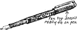
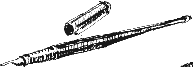
11th February, 2007I’M TRYING OUT two new Rotring ArtPens. The ArtPen, Rotring says, ‘combines the balance and nib shape of the quill pen with the convenience of a modern fountain pen, for easy, aesthetic writing.’
Richard Bell's Wild West Yorkshire nature diary
Sunday,
11th February, 2007
I’M TRYING OUT two new Rotring ArtPens. The ArtPen, Rotring
says, ‘combines the balance and nib shape of the quill pen with the convenience
of a modern fountain pen, for easy, aesthetic writing.’
 |
 |
 |
|
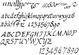
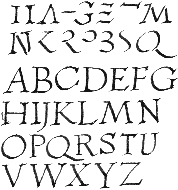
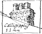
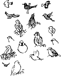
I try out the Calligraphy 1.1 mm nib on the Renaissance Italics |
and Capitals Quadrata alphabets shown on the leaflet supplied with the pen. |
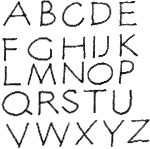
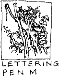
These capitals were drawn with the second pen, which has a Lettering nib, size M. It doesn’t produce the thicks & thins of the calligraphy nib. |
 |
 |
 |
 |
|
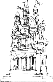
Which of these nibs do I prefer for drawing? |
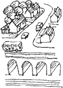
The varying width of the line drawn with the calligraphy nib seems to give the drawing more energy: . . . |
a springiness which would lend itself to organic subjects or fantasy . . . |
while lettering nib gives a clear, consistent line which suggests to me prosaic subjects (or perhaps fantastical subjects treated in a prosaic way). |
 The
lettering nib flows more easily than the calligraphy nib on the acid-free cartridge
paper of my Pink Pig sketchbook but both flow more easily on the smooth writing
paper of my diary.
The
lettering nib flows more easily than the calligraphy nib on the acid-free cartridge
paper of my Pink Pig sketchbook but both flow more easily on the smooth writing
paper of my diary.