|
|
|
|
|
|
Acrylics Refresher Course |
Richard Bell's Wild West Yorkshire nature diary, Tuesday, 26th June, 2007 |
|
|
I'VE DONE SO LITTLE DRAWING recently, mainly because I've been putting my efforts into work in the garden, but yesterday's rain gave me the chance to spend a day in the studio and, as I've got no pressing commitments book-wise, I decided to experiment with acrylics, a medium I haven't used for years.
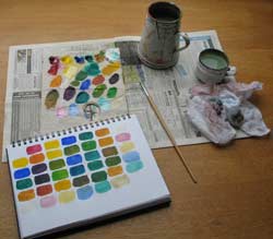
Some time ago a friend sent me a basic set of Winsor & Newton Finity Artists' Acrylics (thank you, Godavari) so, rather than dig out my old colours, I decided to limit my palette to the five (plus white) in the new set:
|
 I
invariably use watercolours, so 'Azo' and 'Phthalo' are unfamiliar names,
although these colours are very much what I would choose. The phthalo
green is a powerful
colour but useful as a starting point for mixing greens,
browns or blacks. But it always needs alizarin crimson in
order to get away from that pervasive bottle greenness, so, for convenience,
I'd
probably add a dark brown, such
as burnt umber, to this selection. I could rummage in the
drawer for a tube but today I want to restrict myself to the basic set and,
with a little extra care in the mixing, they should work fine.
I
invariably use watercolours, so 'Azo' and 'Phthalo' are unfamiliar names,
although these colours are very much what I would choose. The phthalo
green is a powerful
colour but useful as a starting point for mixing greens,
browns or blacks. But it always needs alizarin crimson in
order to get away from that pervasive bottle greenness, so, for convenience,
I'd
probably add a dark brown, such
as burnt umber, to this selection. I could rummage in the
drawer for a tube but today I want to restrict myself to the basic set and,
with a little extra care in the mixing, they should work fine.
To get the feel of the medium and find my way around the palette I started by painting swatches (left) of all the colours and all the two-way combinations between them. I used a cartridge paper sketchbook; acrylics work fine on paper, you don't always need board or canvas.
With my natural history background, observational drawing is
central to my work - something of an obsession, in fact - so I felt that I
should attempt
something
less proscribed
and more painterly. As you can see from the step-by-steps above, I dispensed
with any
initial drawing,
except
for
a
faint pencil outline (step 2, above).
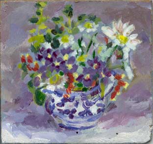
 Jug of Flowers
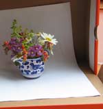
I put the little Spanish jug of flowers from our garden (right) in a trainers box with a sheet of white paper behind it in order to keep the lighting fairly constant.
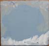
As I was interested in colour, rather than line, I felt that I couldn't start on the flowers until I'd indicated the colour and tone of their surroundings, so I painted in the grey tones in the shadows in the box around the jug (step 1). There's no black amongst the colours in this set and I wouldn't have used it anyway to mix a grey; black plus white can result in a rather lifeless grey.
You can see from the photograph that the greys varied from warm to cool, depending on the reflected light. This was even more noticeable in life, so my greys were a modulated mixture of the three primaries plus white and, frequently, yellow ochre too. I used little, if any, of the phthalo green until it came to the foliage, especially in the shadows.
 I
worked on hardboard, a piece that I'd prepared some years ago by priming it
then adding a neutral grey, mixed as described above. The
advantage of this is that you can easily establish highlights, such as the
white of the daisy petals, the disadvantage is that it tones down the colours
a bit. If you start with a white primed surface this can reflect back through
the brighter semi-transparent colours, such as the
yellows and bright greens, and give a more luminous effect.
I
worked on hardboard, a piece that I'd prepared some years ago by priming it
then adding a neutral grey, mixed as described above. The
advantage of this is that you can easily establish highlights, such as the
white of the daisy petals, the disadvantage is that it tones down the colours
a bit. If you start with a white primed surface this can reflect back through
the brighter semi-transparent colours, such as the
yellows and bright greens, and give a more luminous effect.
But the grey ground was a suitable starting point for the shady corner I'd set up in the trainers' box and the glowering, overall greyness of the day.
It rained all day yesterday and I managed to paint four small acrylics of different subjects, for example my left hand holding the drawing board. Each of these is 4 inches (10 cm) square and take about 90 minutes to complete; rather longer than I'd thought as I was aiming to finish each in an hour.
Today I painted another four small panels, the last of them, since I'd run out of hardboard, on the thick grey card you get backing tear-off watercolour pads. I have no primer in the house at the moment but acrylics are robust and versatile and, as with the cartridge paper, you can work straight onto card. I guess that if you used mounting card, the paper layer laminated onto its surface might buckle when wet but if you had nothing else to hand, it would probably be worth trying.
I said that I've got no plans for books but I realise
that my short, sharp refresher course in acrylics would make a handy little
'how-to' book. So watch this space.
 1
1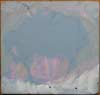 2
2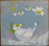 3
3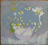 4
4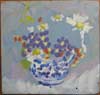 5
5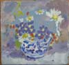 6
6