previous | home page | this month| e-
Inklings
Richard Bell’s Wild West Yorkshire nature diary Wednesday, 30th July 2008
previous | home page | this month| e-
AS I’M DRAWING with a vintage nib (see yesterday), I decide to complete my drawing
with washes of vintage Indian ink from my desk drawer. Before I gravitated to watercolour,
I favoured coloured inks, using them in student sketchbooks and even for some of
my first book illustrations -
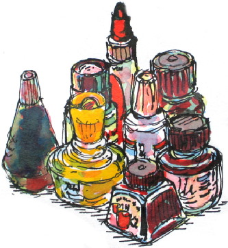
Inks & Acrylics
I used Pelikan (the squat yellow bottle) to start with, then I went on to the Winsor
& Newton range introduced in the mid-
Four Colour Process
After 30 years in the book business it’s natural for me to think in terms of the process colours used in printing; you can build up a range of colours by using the primaries.
Inks are suited for this method as they’re often transparent and, because they often contain either shellac or acrylic, you can usually paint a second wash, or glaze as an oil painter might think of it, without disturbing the previous colour (once it has dried). You can build up luminous colours which have a bit of a sheen to them, reminding me of stained glass.
It adds an unpredictability to the drawing because although 100% red plus blue plus yellow theoretically gives you a neutral black, it can also give you browns, dark greens and purplish greys, depending on the strength of each wash (I usually dilute them with water).
1. Black drawing plus Pelikan Special Red
2. Plus Pelikan Special Blue
3. Plus Pelikan Special Yellow